EDITORIAL DESIGN

This project raises awareness about constant noise and promotes silence for mental well-being. Using Swiss-style design with grids, sans-serif type, and white space, it highlights everyday noise through structured layouts and objective photography. The palette reflects sound: white for overstimulation, black for silence, and pink for calming noise. Clear hierarchy and purposeful colour use visualize the contrast between noise and silence.

SOFTWARE & TOOLS

  • PHOTOSHOP

  • INDESIGN

  • ILLUSTRATOR

DELIVERABLES

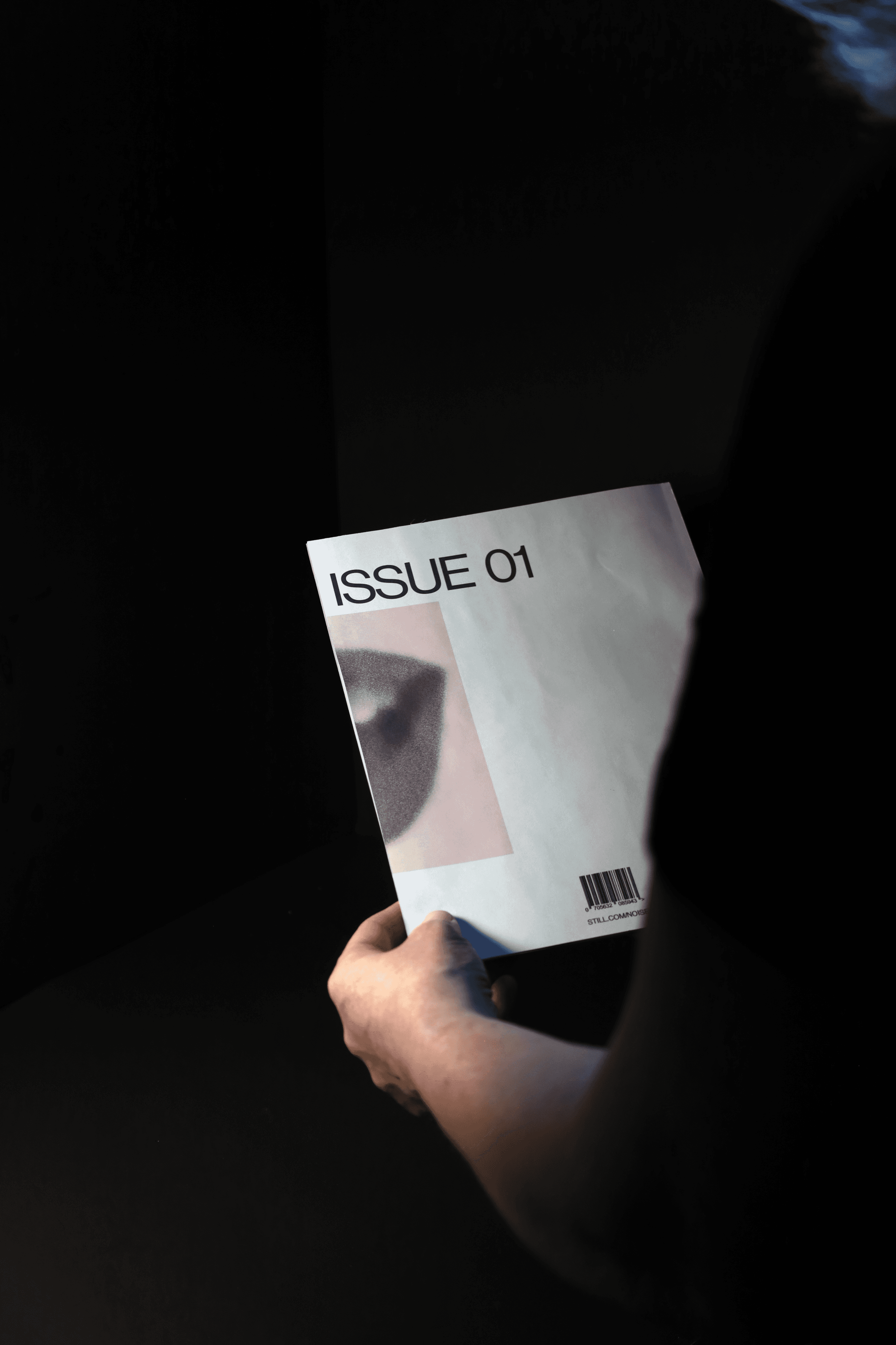
  • Printed book (perfect bind)
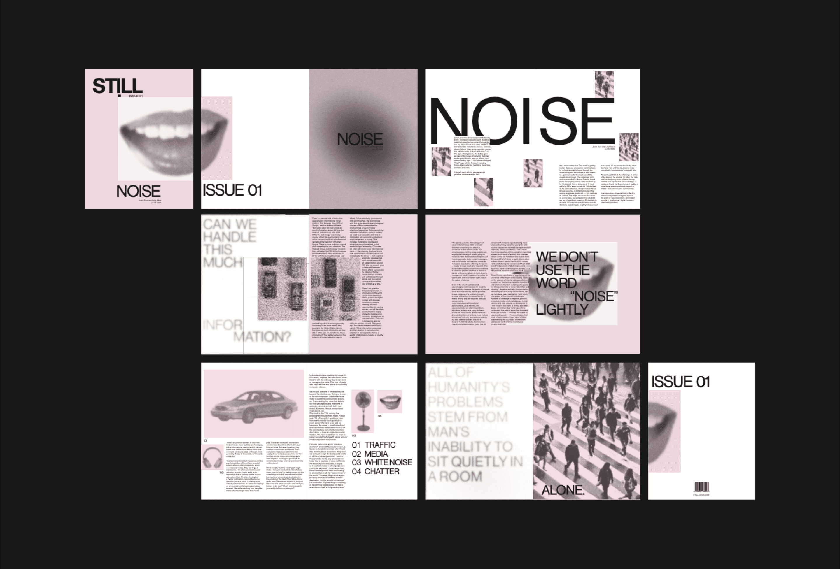
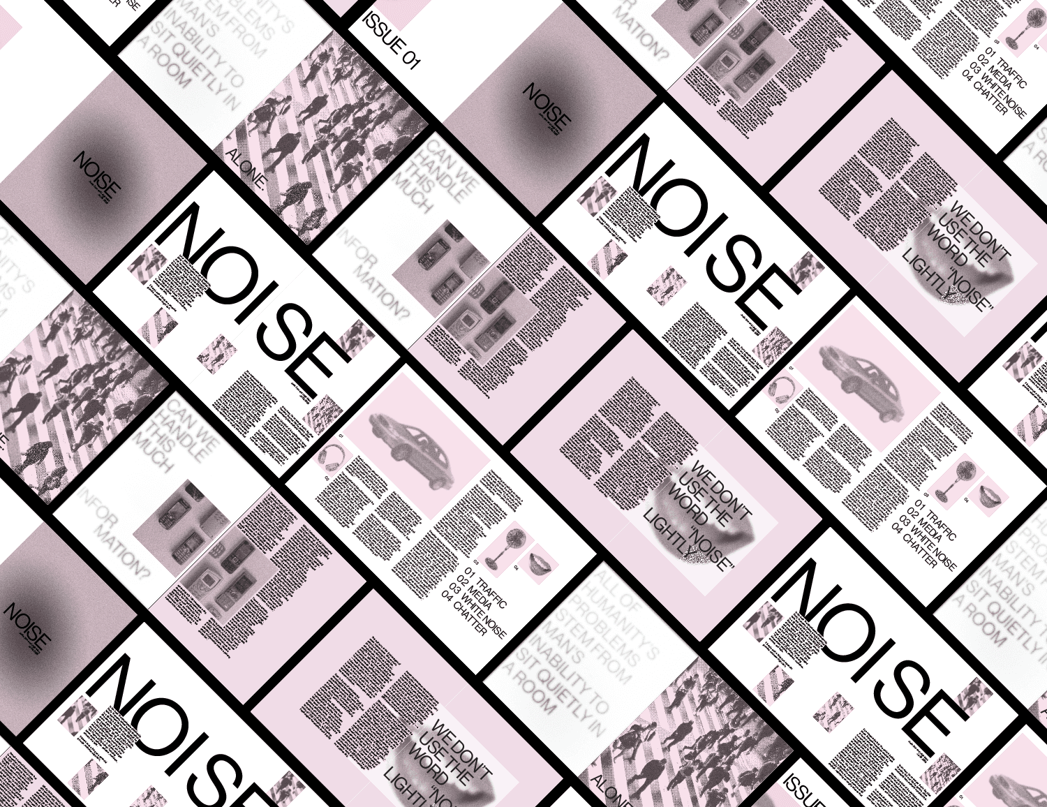
  • Digital spreads

  • Visual identity system

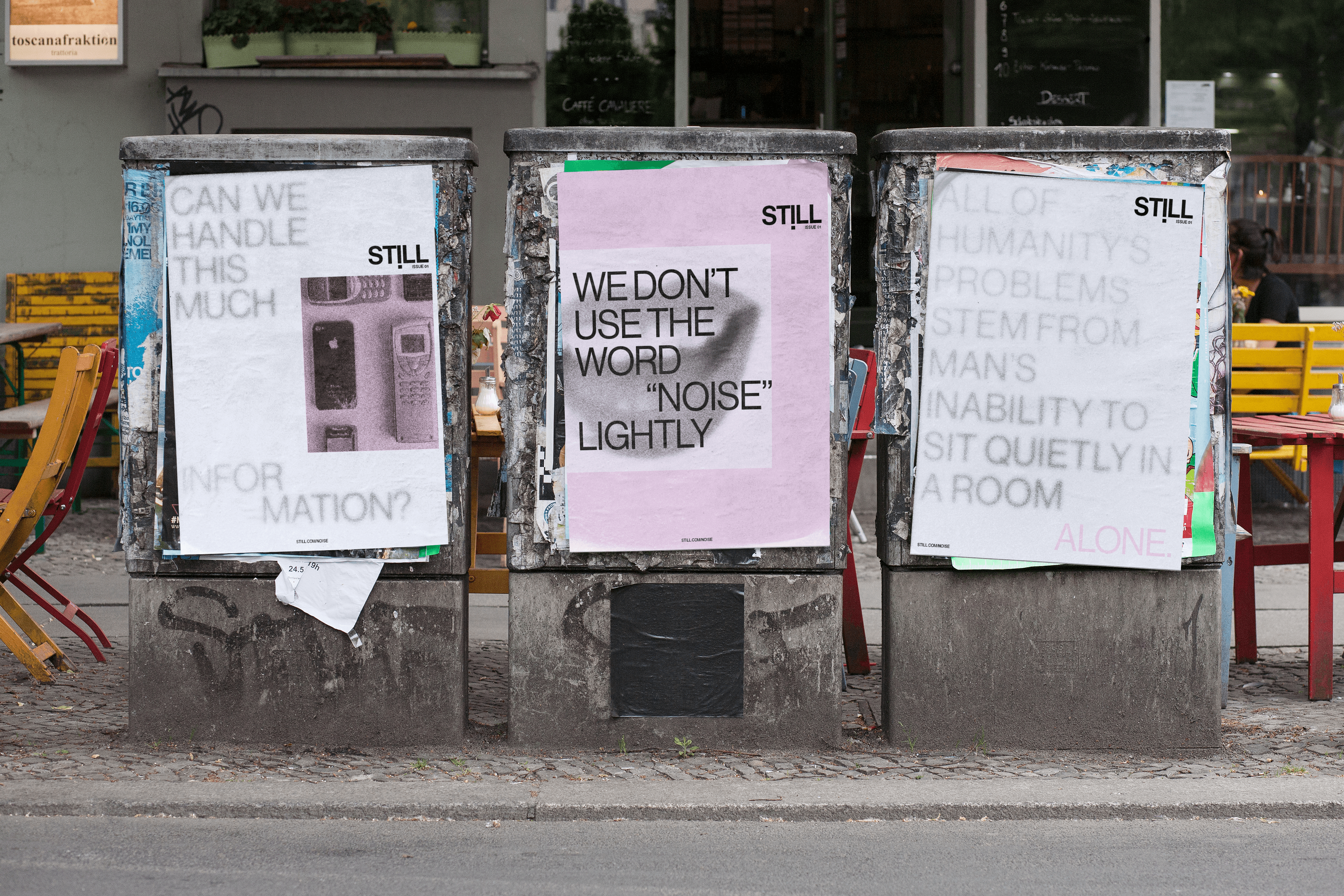
  • Three promotional posters

PROBLEM STATEMENT

In a world filled with constant noise, the challenge was to create a visual system that communicates the strain of overstimulation while showing silence as a tool for well-being.
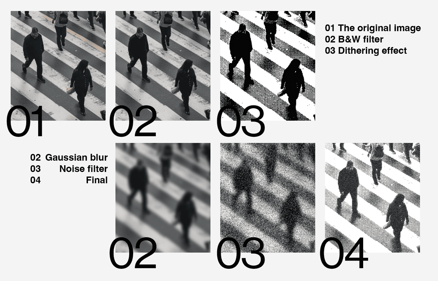
PROCESS

FINAL SOLUTION

FINAL SOLUTION

PAGE SPREADS

MOCKUPS

POSTERS

POSTER MOCKUPS